.png)

WUKA
Emails, Static Ads & Packaging
All concepts were created from scratch - some closely aligned with WUKA’s existing brand aesthetic, and others designed to introduce creative differentiation. The demo includes at least two examples across key design categories: email templates, static ads, and packaging.

Email Design
Template 1
This email template was designed to embody WUKA’s bold, brand identity while clearly communicating product benefits. The layout is clean and structured to highlight key offerings through focused messaging, and layout.
The entire template design draws from WUKA’s existing website colour palette and font combinations to maintain brand consistency and create a cohesive experience across both email and web.
Email Design
Template 2
This template was designed specifically for new product drops, offering WUKA a flexible, refined layout that highlights individual launches while maintaining visual brand integrity. Unlike the core template, this version omits the green header to introduce stylistic variety across campaigns.
The primary background uses WUKA’s signature off-white tone, drawn directly from their website to maintain a seamless visual identity. Dark brown CTA buttons complement the off-white palette. Light green is reintroduced subtly as a highlight for referral prompts, maintaining continuity while allowing room for creative differentiation.
This approach reflects both aesthetic consistency and stylistic range, showcasing how WUKA can stay on-brand while adapting template styles for different campaign types.

Packaging & Labels
E-Commerce vs In-Store
My approach to packaging and labels is rooted in minimalism when dealing in eCommerce. At this stage of the sales funnel, the customer has already made a purchase, so the packaging doesn’t need to say more than your brand name. It’s about reinforcing brand identity with simplicity and elegance. However, for shelf-listed items, the approach shifts. In a physical retail setting, packaging needs to work harder, catching the customer’s eye and clearly communicating product benefits at a glance. In this demo, I’ve designed packaging and labels for both scenarios to reflect that strategic distinction.


Static Ads
Minimal v Informative
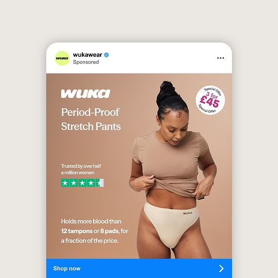
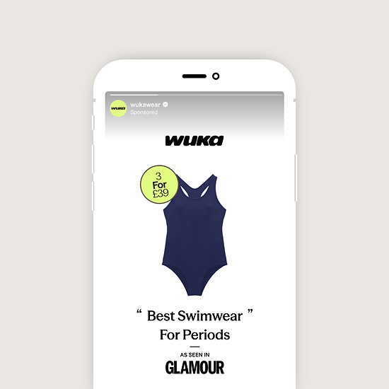
My approach to static design always starts with where it sits in the sales funnel. One ad might have up to five variations—each tailored to speak to a different stage of the customer journey. That could mean attracting new interest, retargeting visitors who didn’t convert, or re-engaging loyal customers with new releases and restocks.
For this demo, I’ve created four different ads using just two visual styles to demonstrate range. One is more minimal and understated, while the other leans into a more informative, sales-focused approach.