Booking.Com
A Genius Upgrade
Task: Booking.com is looking to refresh its email design system for the first time in over ten years. They want a modern, clean look that improves readability, and aligns with its mobile-first experience.
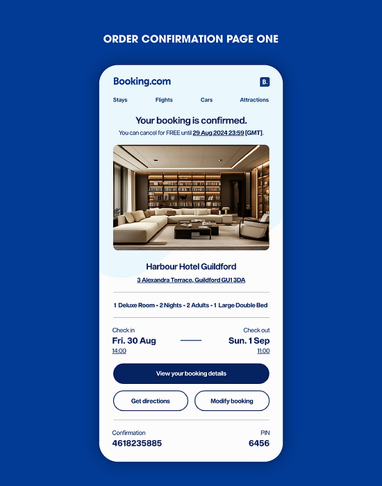
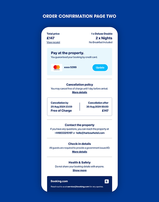
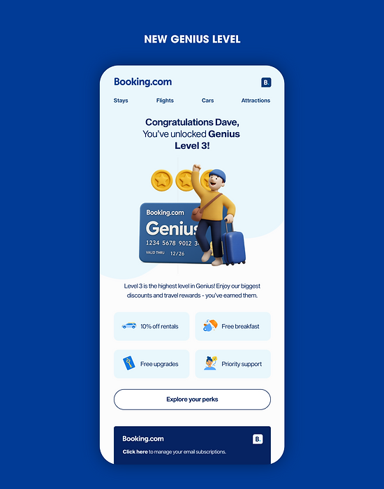
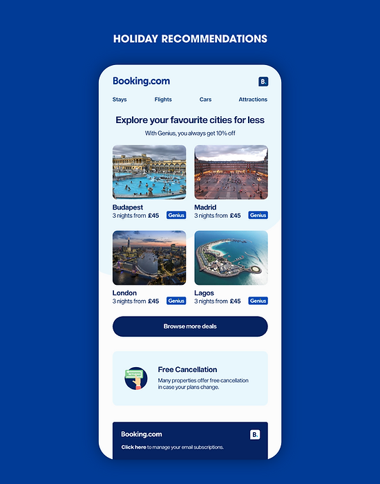
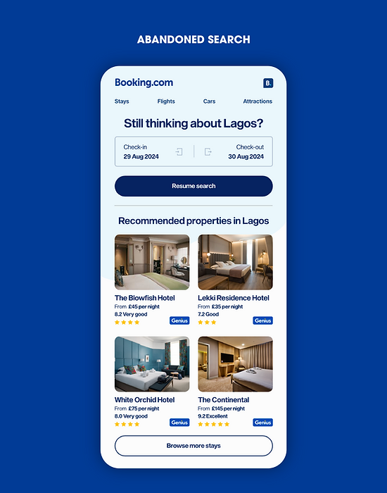
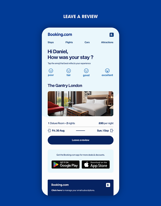
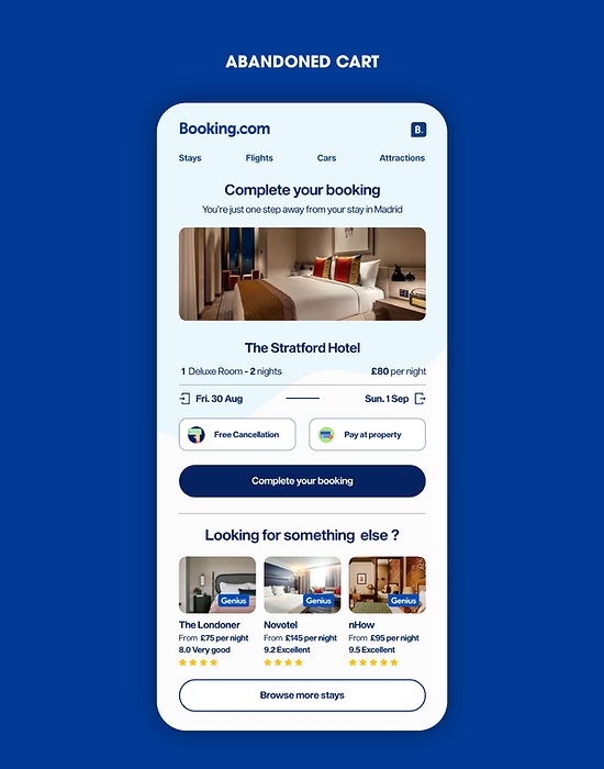
For this project, we explored multiple design directions before landing on a clean, modern system that aligns with Booking.com’s broader digital experience. The objective was to replace outdated email templates with a layout that’s mobile-first, visually consistent, and easier to navigate. We used a card-based structure with clear hierarchy, generous white space, a persistent navigation bar, and subtle gradients to make the content more scannable and user-friendly. While the redesign introduces a fresher, more elevated tone, it still stays true to Booking.com’s core brand elements.


Next Project
